Applying Transparent Color in Photoshop

By Justin Gerard

In a recent post I was asked if I'd go into more detail about how I apply and saturate color when I work digitally. Today, I'll be giving a brief overview of this.

Please note that this post is geared toward people who are familiar with Photoshop, but still searching for how to best use it to colorize their illustrations. Photoshop Geniuses may find the following a little basic. (Digital ninjas, yetis, warriors, and Kevin Sorbos will find this utterly beneath them)

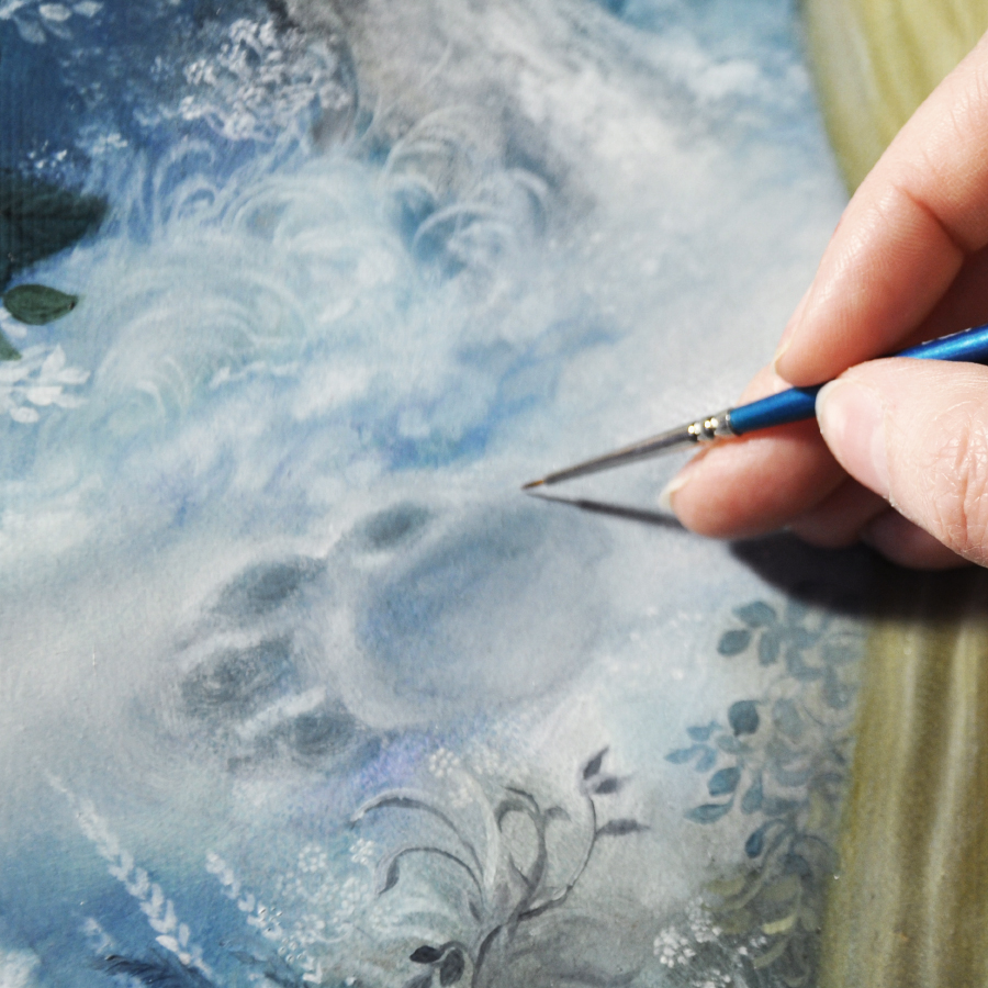
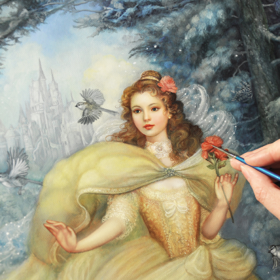
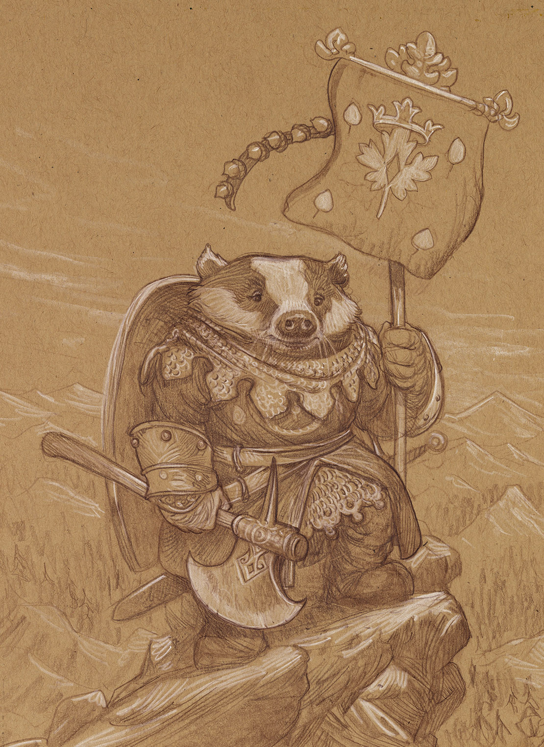
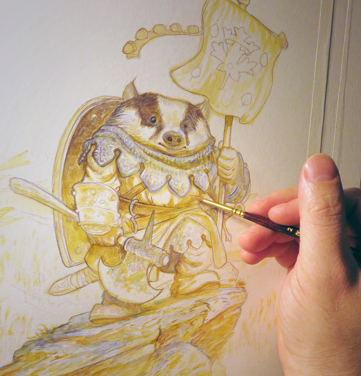
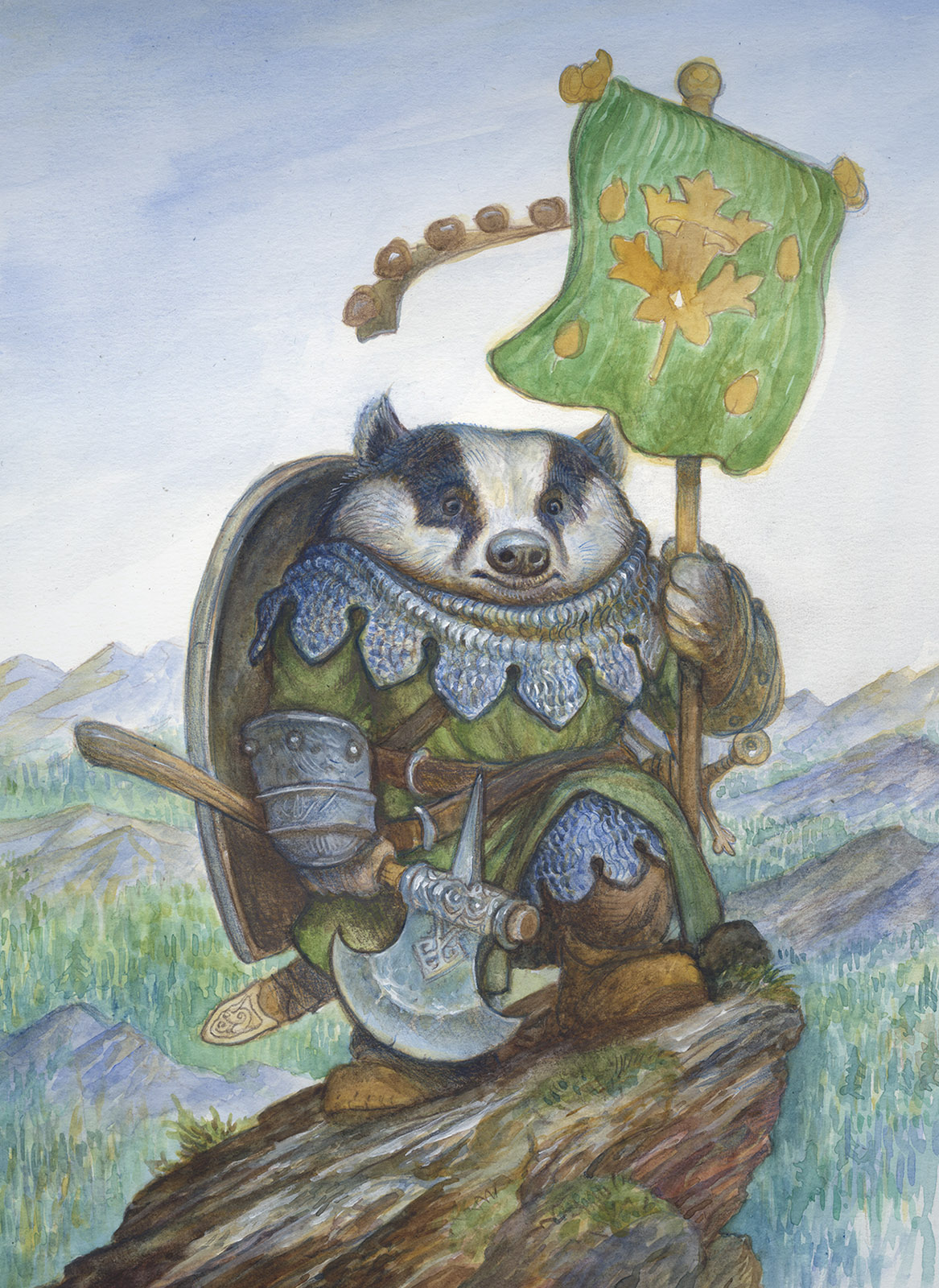
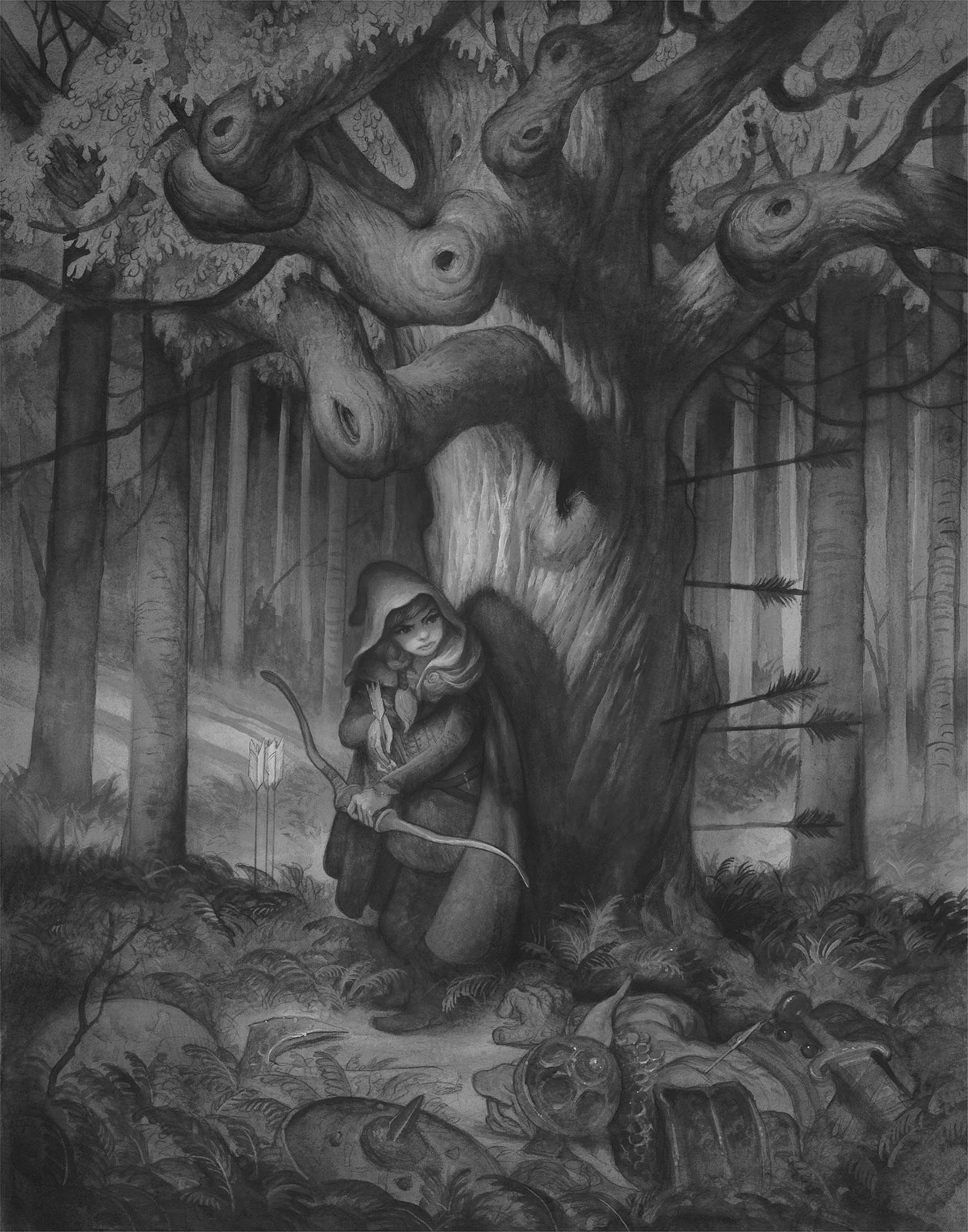
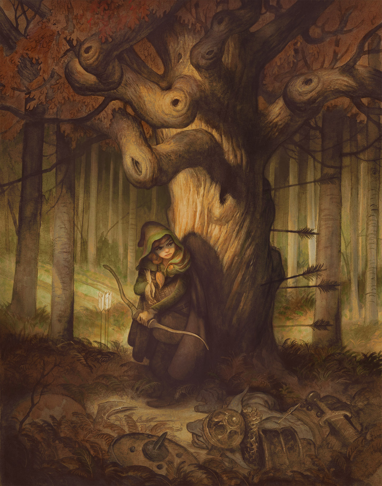
For the purposes of this post, I created the above monochrome watercolor to colorize. I usually work over full color watercolors, but this should help keep things a bit simpler. (Just know that you can use all these same principles when working over full color work!)

NOW, FIRST OF ALL:

Painting digitally over drawing or a monochrome painting has 2 major pitfalls to avoid:

#1 The Pernicious Photo-tint Look.  (Think: old colozied photographs) We don't want this.

#2 The Vile Plastic Over-painted Look. (Think: purple wolf baying the moon airbrushed onto the side of a mobile home) We don't want this either.

The first pitfall suffers from too much information from the original image, while the second suffers from not enough.  We want somewhere in between.  And thankfully, Photoshop has been built specifically for this. All we have to do is use the right combination of tools within it.

SO LET'S GET STARTED WITH THE BASICS:

Layer Modes 

To apply color in Photoshop I begin by making a new layer and then selecting a mode for it.  In the example below of Little Red "Gonna-Ruin-Your-Day" Riding Hood, I have applied a flat red color to a selected area of her cloak.  As I change the layer mode we see how the effect dramatically changes. 


As you can see, most of these when used alone, will leave our image looking photo-tinted. (Pitfall #1) 

That is where a process of applying a combination of several different layer modes in sequence can be extremely helpful. Consider the following combinations:


Notice how the final effect in all of these offers a more natural looking saturation of colors. Here's why this works:

A surfaces true color is only revealed in the area between the direct light and the shadow. 

For this reason, we are only used to seeing "true" red in limited areas. When we see an object painted in a single shade of red, it looks wrong and somehow flattened.  This is because where the object receives direct light, the red will take on the color cast of that light, and where it is in shadow, it will take on the color cast of the environment's ambient light. Furthermore as objects recede from the viewer the color is further altered by atmospheric perspective.

Certain layer modes saturate more heavily than others. Some darken as they saturate, others lighten.

OKAY JUSTIN, THIS IS STUPID AND YOU'RE STUPID. WHY NOT JUST PAINT WITH NORMAL LAYERS?

Normal layers are great! If you are just getting started, you should work with just these until you feel you understand them.  They behave the most predictably and are extremely versatile if you are using brushes with low flow or opacity. 

However, if you are adding digital layers over top of a traditionally painted image you will find that eventually you obliterate portions of your original, and the that the final effect is plastic and uneven. (Pitfall #2)  To truly take advantage of Photoshop's power, you need to use transparent layer modes.

Photoshop has a dizzying array of options for colorization. What is important is finding what works for you. There is no real right or wrong. It is just whatever you can use to get what's in your head onto the screen.

For me, the majority of my transparent layers are made up of Multiply, Color, Soft Light and Screen.  You can do essentially anything with just these four and end up with a solid image.


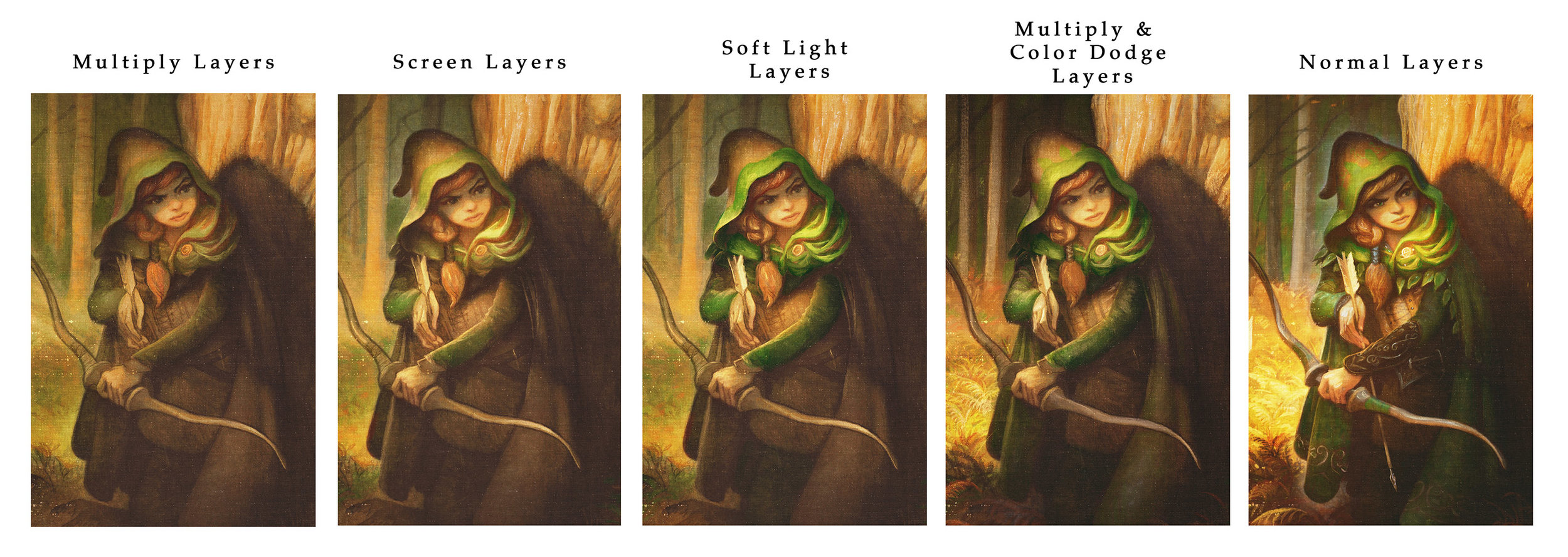
Multiply Layers tend to darken and add chroma in a very dull application. This is great for slowly building up colors and adding texture and tone to your image. It is very much like working with traditional watercolor. Great for building shadows and toning your image.

Screen layers are essentially the opposite of multiply, these also add color slowly, but they lighten instead of darken. I use these to add direct lighting over the dark layers below.  By picking a warm yellow color here I am able to slowly work up a nice natural looking lighting effect to my figure. 

Soft Light Layers are bonkers. They have no master, and obey no man. The math that governs them is not fully known to science. What I do know is that when a bright color is used on a soft light layer, it will allow for a very bright saturation of color which does not affect the details beneath it.  For instance, I used a bright green color on a soft light layer to really pop the bright greens out from the rest of the image. 

Color Dodge Layers scorch out highlights. They are extremely brutal and should be used VERY sparingly. Too much and you are lighting your birthday cake candles with a flamethrower. But when used sparingly, they can help to intensify your brightly lit areas as well as any glints of detail light. I use Color Dodge layers to sharpen highlight areas, add rimlights, and sharpen object profiles against their backgrounds. When alternated with multiply layers it will help push the value range of the image.

Color Layers. Not shown here because I use them so sparingly, but I do use basic color layers to push and pull color in limited areas. The Color layer mode is the classic means of photo-tinting, (and I need not badger you any further with warnings there). Just know that you shouldn't overuse them, but that in limited doses they are excellent.  For instance, killing chroma: If an area is too red, I can select a blue color and lightly apply it on a Color Layer and it will pull the red back into check.

Normal Layers. Finally, there is just no escaping at least some opaque work for me when I work like this. But now that we have already established our value range and our colors are fully laid out, we can add details and opaque work that blends rather seamlessly with the rest of our image.  I also use it very transparently and often set the layer opacity to less than 50%.   

This general sequence offers me solutions to the problems I generally face as I work through an image. Everyone's artistic temperament is a little different, so play around with the different modes in different sequences and see what works best for you.


I hope this was helpful! As always, I take post requests, so if there is something you'd like me to cover please let me know in the comments!

Be Our Guest

Disney and Gallery Nucleus are collaborating on a "Beauty and the Beast" inspired art show in anticipation of the new film. We are very excited to be participating in such a monumental event!

"Winter's Rose", 18x24, oil on canvas, Annie Stegg Gerard, March 2016

"Winter's Rose", 18x24, oil on canvas, Annie Stegg Gerard, March 2016

BE OUR GUEST: AN ART TRIBUTE TO DISNEY'S BEAUTY AND THE BEAST
March 11, 2017 - April 2, 2017
Opening Reception / Mar 11, 7:00PM - 10:00PM

Miyazaki Tribute Show

I am so honored to be participating in Spoke Art's Miyazaki Tribute Show in their San Francisco gallery.  I decided to illustrate My Neighbor Totoro, because it was the first Studio Ghibli movie I saw when I was a child.

I will have the framed original available at the show, as well as a limited run of 50 canvas prints.   

"King of the Forest"  8x10 oil on canvas, Janruary 2017

"King of the Forest"  8x10 oil on canvas, Janruary 2017

Limited Edition Giclee canvas prints (run of 50)

Limited Edition Giclee canvas prints (run of 50)

Screenshot 2017-01-20 12.58.56.png

Exhibition dates: 
Thursday, February 2 - 25, 2017

Opening night reception:
Thursday, February 2nd, 6pm - 9pm


Spoke Art
816 Sutter Street
San Francisco, CA 94109

3D Total's Masters of Sketching

Hey guys! I wanted to share some images from "Masters of Sketching" by 3DTotal. The book is available for preorder. The book is 272 pages long and includes tutorials from myself along with some pretty amazing artists! All preorders come with a free sketching bundle. The book will be available on December 5th <.  arti. dfgdfgdfgdfgd. werwerwerwerwerwerwerwerwrwerwersdfsdfsdfsdfsfdsfsfdsfdsfsfssdfsdfsdfsdfsdfsfsf. 

Featured Artists Include:

Patrick Ballesteros, Paride Bertolin, Mike Corriero, Tom Fox, Eliza Ivanova
Zoe Keller, Kikyz1313, Abigail Larson, Sean Layh, Larry MacDougall, Jeremy Mann, Christina Mrozik, Jim Pavelec, Bobby Rebholz, Kirill Semenov, Annie Stegg Gerard, Ania Tomicka, Eduardo Vieira, Colie Wertz, and Sam Wolfe Connelly

Art

DSC_3388.jpg

Badgers and Cheap Watercolor Paper

By Justin Gerard

HAPPY AMERICAN ELECTION DAY. Let's not talk about it. Instead, I have a garbage review of some cheap paper for you!

I've found that sometimes, the cheapest materials out there are all you need. Like hot dogs. You don't need Châteaubriand and caviar every day.  (Maybe I don't need hotdogs everyday either but let's stay on topic) In a world of spectacular art materials, a sheet of basic copy paper and a Bic pen, which together cost less than pocket lint, are still fantastic tools. Perhaps you can't paint the Sistine Chapel with them, but they are more than sufficient enough to sketch out the idea with.  Being cheap doesn't always mean being bad. 

Recently, like a plague of Kudzu overtaking the interstates of eastern America, I've seen more and more of these Canson XL pads cropping up anywhere that sells art supplies. And like most other aspiring artists out there, I still hold out hope that there is a secret set of materials that, if found, will do all the hard work of painting for me.

All I have to do is find it and the fountain of youth, a comfy chair, and I am set!

To this end, I often try out a lot of the new stuff, regardless of wether or not it is being marketed towards students, weekend watercolorists, or panda bears.  

Canson's student grade XL series offers a variety of paper types, Bristol, Drawing, Mixed Media, Watercolor, Sketching, and so on. All of which are priced amazingly low compared to other similar papers on the market. They are also all recycled and made using sustainable means and whatnot. So you can feel smug and superior to everyone else while you draw.

I gave each of the papers a try (since they are basically free). They all feel surprisingly okay to work on and do a serviceable job at what they are marketed for. I was most impressed with the Mixed Media paper. While it has not done anything for me as far as mixed media goes, it was wonderful to draw on. 

(It just seems to be poorly branded.  It should probably be called, "VERY Dry Media Paper" or "Use Pencils Only Media," or "Only Self-loathing Masochists Use Watercolor On Paper Like This."  I leave the exact phrasing up to Canson's Branding division.)  

One of the more interesting aspects of the XL paper, is that each page offers 2 separate drawing experiences on the front and back. One side is smooth and the other offers more texture.   

For testing out their wet media I picked up a pad of the XL Cold Press Watercolor Paper. I'll be honest: I usually hate cold press paper.  It is often absurdly textured, as if painters only ever wanted to paint on cinder blocks or tree bark but were duped into using smooth papers by the Illuminati and Lizard people. However, Canson's XL paper is a very lightly-textured cold press, and actually feels a bit like something in between a Fabriano hot press and a more Strathmore cold press. So it works great for someone who prefers something in between.    

So how does it handle?

I like how it takes pencil and I love how laying in initial colors feel on the paper. Paint goes on smooth and can be pushed and pulled rather easily.  It allows a little bit of lifting out of light colors, and dark colors can be pulled out all together if you like. This is great if you don't care too much about using very wet washes and you prefer to noodle the colors around as you paint.  (As someone who probably applies too many washes this is annoying, but that is why I tend to work on vellum bristol over cold press papers in general anyway). Bottom line: if you like watercolor paper that behaves like watercolor paper, it does the job.

VERDICT:

As far as a purely watercolor paper goes, Canson's XL cold press paper is a lot fun and I would recommend the paper if you are looking for something basic and affordable to work with every now and then.  

If you plan on painting the Sistine Chapel, I might recommend some of the heavy hitters of the watercolor world,  but at a tenth of the price, this is a great alternative.

If you do want to try some of the more expensive papers with similar feels to them, try out Fabriano's 300g Hot Press paper, Strathmore's 500 series illustration board for wet media, and Canson's own Montval Cold Press.

----

Note 1: In closing, I should note here: Materials are important, but they aren't THAT important. A good artist could work on anything, even tree bark and it would still be impressive. But what materials can do is make your life easier and may allow you to better play to your strengths as an artist.  However, there is no silver bullet or secret formula that can make up for lack of practice and technical ability.


Mission Blue

Mission Blue is a project developed by Sylvia Earle to create "Hope Spots" around the globe within our oceans. These areas act as nature reserves, letting them heal and regenerate. The intention of this show is to bring awareness and to raise funds for this charity.  

My contribution is "Red Deep".  A piece inspired by the endangered Deepwater Redfish,  an amazing creature that can live up to 75 years in the wild. Fisheries are the main threat to the survival and recovery of the species. 

If you are interested in the original painting, contact: info@havenartgallery.com

The Haven Gallery is located 155 Main Street, Northport, NY and theMission Blue show runs from October 29-November 27th. Details are up at

http://www.havenartgallery.com/upcoming-shows/

The opening will be October 29th from 6-8pm.

IlluXCon preview

Gallery Gerard will be in Reading, PA at the Goggleworks center for IlluXCon 9.  Here are the brand new pieces we will be debuting at the show this year. 

"Guardian of the Gate" Annie Stegg Gerard, 6x6, oil on canvas, September 2016

"Guardian of the Gate" Annie Stegg Gerard, 6x6, oil on canvas, September 2016

"Hylonome in the High Forest", Annie Stegg Gerard. 16x20, oil on canvas, October 2016

"Hylonome in the High Forest", Annie Stegg Gerard. 16x20, oil on canvas, October 2016

"Chariclo and Chiron", Annie Stegg Gerard, oil on canvas, October 2016

"Chariclo and Chiron", Annie Stegg Gerard, oil on canvas, October 2016

"Autumn Moon" Annie Stegg Gerard, 8x8, oil on canvas, October 2016

"Autumn Moon" Annie Stegg Gerard, 8x8, oil on canvas, October 2016

"Wizard's Revenge", Justin Gerard, watercolor and acrylic, October 2016

"Wizard's Revenge", Justin Gerard, watercolor and acrylic, October 2016

""Sketchbook Portrait #9", Justin Gerard, 11x14, oil on mounted board, October 2016

""Sketchbook Portrait #9", Justin Gerard, 11x14, oil on mounted board, October 2016

"Sketchbook Portrait #12", Justin Gerard, 9x12, watercolor and acrylic, September 2016

"Sketchbook Portrait #12", Justin Gerard, 9x12, watercolor and acrylic, September 2016

"Treebeard", Justin Gerard, 11x14, oil on board, October 2016

"Treebeard", Justin Gerard, 11x14, oil on board, October 2016

Sketchbooks shipped

Hey guys!  "The Gryphon Hunters" and "Fairy Tales and Folklore" shipped out on Friday.  Thank you all SO MUCH for making this such a successful 2016 sketchbook release. While all of the limited edition books have been sold, we still have some of the standard edition books in our shop!

Through Dangers Untold

Come see our work at Gallery Nucleus SEPTEMBER 17 from 7-10PM in celebration of the 30th anniversary of the 1986 fantasy film, Labyrinth.  There will be over 35 original art pieces paying tribute to this Jim Henson classic. Cory Godbey's new book "Labyrinth Tales" will also be available for purchase.

THROUGH DANGERS UNTOLD: A LABYRINTH 30TH ANNIVERSARY TRIBUTE EXHIBITION
September 17, 2016 - October 2, 2016
Opening Reception / Sep 17, 7:00PM - 10:00PM

1608Labyrinth-v1x02be.jpg
"Goblin's Bane", 8x10, watercolor on paper, Justin Gerard

"Goblin's Bane", 8x10, watercolor on paper, Justin Gerard

If you live in the Atlanta area, be sure to check out the Center for Puppetry Arts special Labyrinth exhibit.  They will be holding a costume contest judged by Brian Henson, Chairman of The Jim Henson company.

"None May Pass", 8x10, oil on canvas, Annie Stegg Gerard

"None May Pass", 8x10, oil on canvas, Annie Stegg Gerard

Labyrinth 30th Anniversary tribute show

We will be participating in Gallery Nucleus' Labyrinth 30th Anniversary tribute show next Saturday.  Here are some sneak peeks of the paintings we will be exhibiting!

"None May Pass", 8x10, oil on canvas, Annie stegg Gerard 

"None May Pass", 8x10, oil on canvas, Annie stegg Gerard


"Goblin's Bane", 8x10, watercolor on paper, Justin Gerard

"Goblin's Bane", 8x10, watercolor on paper, Justin Gerard

THROUGH DANGERS UNTOLD: A LABYRINTH 30TH ANNIVERSARY TRIBUTE EXHIBITION
September 17, 2016 - October 2, 2016
Opening Reception / Sep 17, 7:00PM - 10:00PM

DragonCon 2016 Wrap up

We are home from DragonCon! It was my 7th year attending this event, and Justin's 4th. We had such an amazing time at the show this year.  Thank you so much to those of you who came to see us this past weekend.  I can't believe it will be a whole year before I see some of you again!  

This year's show had some of the most memorable moments of any convention we have ever attended. We even got to play a small part in a marriage proposal in front of our booth.

As with every art show we attend, we come home with fresh inspiration and ideas for new projects.  I have found that being surrounded by so many artists and beautiful paintings is very nurturing to the creative process. Justin was able to thumbnail out a project we are thinking of starting next year while working the booth (I'm super excited for this one). 


Another highlight this year is that "Moonlight Parade" won Best in Show.  I am so honored to have one of my favorite pieces recognized.  A special thank you to the jurors Daren Bader, Stephan Martiniere, and Scott Fischer, whom are all artists I look up to greatly.  

Its always a little sad when a show comes to a close.  As artists and introverts, we tend to stay at home most of the time.  We paint all year,  and at art shows like this, we are finally able to reveal our endeavors to the world.  It is both terrifying and wonderful.  I feel like I can't say it enough, but thank you again for your support over the years.  It is still amazing to me that we are lucky enough to be able to have a job that we truly love. 

~Annie


2016 Sketchbook PRE-ORDERS are LIVE!

The pre-orders for both the standard editions and Limited Editions of our 2016 Sketchbooks are now available in our store!

ALL pre-orders received before September 1, 2016 will receive a bonus matted and hand-signed 5"x7" mini-print FREE!

This year, Justin is offering 50 and Annie is offering 25 Limited Edition copies. Each Limited Edition Sketchbook includes an original drawing by the artist on the title page. Check out some of last year's original drawings here!


Each Limited Edition copy is hand-signed and numbered and comes with a separate signed and matted 5"x7" mini-print. 

Faeries are the theme of the mini-prints this year, and Justin and Annie's prints each reflect their own unique take on the subject... 

SHIPPING: All Pre-orders are scheduled to be shipped out by August 29, 2016. All books are sleeved and shipped in sturdy mailer boxes for increased durability during delivery.  Please allow 2 weeks for Continental U.S orders and 3 weeks for International orders to arrive. 

Also! For those of you who plan to attend DragonCon in Atlanta, GA on September 2-5, we will be offering advance copies of our Standard Edition Sketchbooks for sale!

PAYPAL Orders: We've received many requests to allow customers to pay with Paypal, and we've heard you. So this year, we are offering an Etsy listing for both our Standard and Limited edition sketchbooks which will accept PAYPAL at checkout. Check out our Etsy for more information. 

Sketchbook 2016 preview

Most of the time I try to provide, thoughtful, in-depth, considered blog posts that are hopefully informative, thought-provoking and interesting. Well today I'm taking a break from all that to bring you some shameless self-promotion.  No more salad and steamed vegetables, it's time for cheeseburgers made of donuts and bacon! 

Today I'm sharing a preview of Annie and I's Sketchbooks for 2016, which will be available for pre-order August 25! For Justin's sketchbook, this year will feature many gryphons, dragons, dwarves, orcs, and all manner of pestilence and assorted villainy.

As with previous years this sketchbook will include a great deal of development sketchwork as well as finished paintings. It gives an overview of the development procedures that go into designing and illustrating the scenes I paint. 

SB2014-S07Ce.jpg

While my book focuses on misadventures and monsters both foul and wicked, Annie's sketchbook focuses on creatures a bit more magical and refined... 

Annie will be showcasing 5 new oil paintings in her sketchbook as well as the preliminary sketches, drawings and developmental work it took to create each one.  It also features and in-depth tutorial where Annie outlines both the tools and techniques she uses to achieve the classical feel of her work. Her book covers a variety of fairytales and folklore from the early 19th century including works by Hans Christian Andersen, the Brothers Grimm and J.M. Barrie

Annie-Stegg-Gerard-SB2016-04e.jpg
Annie-Stegg-Gerard-SB2016-02e.jpg

Both books will be available for pre-order on August 25 at 12 noon EST from our shop. Each book in this limited run is hand-signed and numbered by the artist and will ship in September.

The first 50 individuals who order will receive a highly limited signed and numbered mini-print. (More on that soon!)
And as with previous year's book we will be offering a limited edition run of books with a hand-drawn original inside.  We hope you will drop by to take a look on the 25th!